
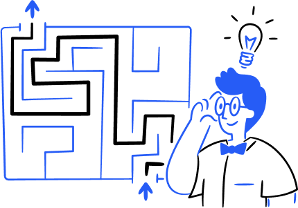
Heuristic Evaluation & Redesign: Myfitnesspal

As part of my UX Design program at BrainStation, I was tasked with conducting a heuristic evaluation of a mobile application.
Alongside my teammate, Haiqa Bilwani, I chose MyFitnessPal—a widely used fitness app known for tracking nutrition, calories, and exercise.
We intentionally selected a high-rated, established product to challenge ourselves and critically analyze the design decisions behind its mature interface.
Role: Heuristic Evaluator,
UX/UI Designer
Platform: Android
Tools: Photoshop, Figma
Duration: 2 Weeks
Using Jakob Nielsen’s 10 Usability Heuristics as our yardstick, we evaluated everything from visibility of system status to error prevention.
Jakob Nielsen's 10 Usability Heuristics
1: Visibility of system status

2: Match between the system and the real world

3: User control and freedom

4: Consistency and standards

5: Error prevention

6: Recognition rather than recall

7: Flexibility and efficiency of use
8: Aesthetic and minimalist design
9: Help users recognize, diagnose, and recover from errors

10: Help and documentation

Severity Scale
Our severity scale ranged from cosmetic issues (the app’s version of a bad hair day) to usability catastrophes that need fixing before release.
In short, not every design flaw is a life-or-death matter, but some feel like they are.

Heuristic passed:
this is not a usability problem at all
Cosmetic problem:
This need not be fixed only if extra time is available on the project.
Minor problem:
This should be given low priority

Major problem:
important to fix, so should be given high priority

Usability catastrophe:
imperative to fix this before product can be released
Task flow
One of the core functions of the MyFitnessPal app is calorie tracking. I began by documenting observations across each screen throughout the tracking process.
Task flow - App screens
I captured screenshots of each screen encountered while tracking daily calories. I observed a mix of well-executed and confusing interfaces.
Upon launching the app, the tutorial screen appears by default. However, there is no visible "X" or exit option'; tapping the "+" button is the only available action.
After tapping the “+” button, the user is restricted to logging food, with no way to close or bypass the tutorial screen.

The “Select a Meal” screen is pretty standard with various options to input a meal. Needless to say, well designed.
Usually, a badly designed screen screams at you, but a well-designed screen goes unnoticed.

After logging an apple (breakfast entry), the app provided a detailed breakdown of its macros, an especially helpful feature for users focused on calorie tracking and weight management.

This was my first interaction with the home screen, as I was previously forced to log food without an option to exit.
The screen felt overwhelming, displaying calorie tracking, step count, exercise logs, weight tracking, habit goals, and more


To explore the user experience, I attempted to edit my breakfast by deleting the apple entry. From the "Diary" tab, I accessed all logged items, then:
I long-pressed the Apple entry.
Tapped “Delete Entry.”
Breakfast with oatmeal & milk without the apple entry.

After logging food entries throughout the day, I decided to delete the dinner entry by itself.
It took me some time to figure out how to delete dinner.

I long-pressed the Dinner entry, but nothing happened. So,
I tapped the kebab menu on the top right
I tapped “Edit Diary.”
Checked Dinner entry
I tapped Delete.
Dairy without Dinner.
While tracking calories, I identified four key issues that violate five of Jakob Nielsen’s Usability Heuristics. The issues are listed below.
1. Deleting or Editing entries
Issue:
Inconsistent interactions: Deleting a food item requires a long press, while deleting a meal needs multiple taps. (Kebab Menu → Edit Dairy → Select Dinner → Tap Delete).
Deleting a food item
Deleting a meal
Enable long-press on a meal or food item to edit or delete, ensuring a consistent and intuitive experience.
Solution:
Deleting a meal
Violations:
2. Recognition rather than recall
1. Consistency and standards
2. No Notification for Possible Error
The app accepts repeated entries for the same food item without notifying the user.
Issue:
By highlighting a prompt, users will be notified if they add any food item twice. This will help prevent errors due to duplication.
Solution:
Violations:
Error prevention
3. Limited Action
The PLUS icon appears on launch, forcing users to log food with no exit option.
Issue:
Adding a cross button gives users an option to exist if they dont want to add food right now hence increasing user control and freedom
Solution:
User control and freedom
Violations:
4. Overwhelming Design For Dashboard
The dashboard is cluttered with scattered data and ads, overwhelming users and making navigation difficult.
Issue:
Giving users the option to customize the dashboard based on what is important to them will make the dashboard look cleaner and not overwhelm the users.
Solution:
Aesthetic and minimalist design
Violations:
Heuristic Violations FOUND: 5
Aesthetic and minimalist design
User control and freedom
Error prevention
Recognition rather than recall
Consistency and standards
Key Learning
Non-intuitive or overly complex processes can significantly degrade the overall usability of the app.
Enabling users to complete tasks within a single, cohesive flow enhances efficiency and reduces frustration.
Providing the freedom to navigate and customize the app ensures users can tailor the experience to their personal needs, avoiding restrictive interactions.
Streamlining task flow can significantly improve user experience.
Key Learning
Conduct user testing to validate your design improvements with real users, identify any remaining usability issues, and gather actionable feedback for further refinement.